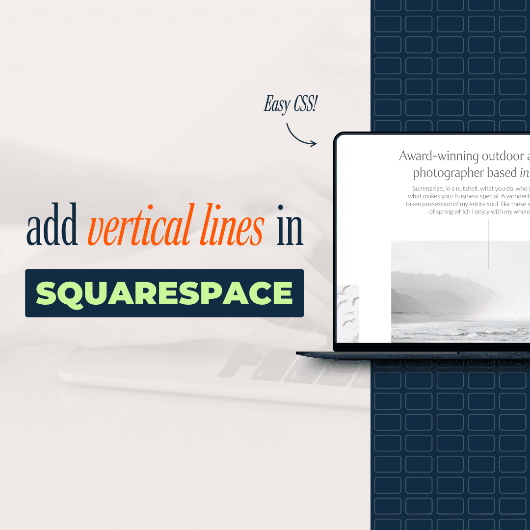
How to Add Vertical Lines in Squarespace Without Code Blocks
If you’ve tried adding a thin vertical line with a code block in Squarespace’s Fluid Engine, you've probably seen the same issue: the line is narrow, but the block around it isn't.
Thankfully, there's a cleaner option. By turning one unused shape into a vertical line with CSS, you can place, resize, and recolor the line with far less friction.
Why code blocks can be frustrating for vertical lines
Code blocks are the method many other tutorials use. There's nothing wrong with that on its own. The trouble starts when you're trying to make something as small as a thin divider.
The Fluid Engine width problem
In Fluid Engine, a code block can refuse to shrink as much as you need. Even when the content inside it is only a slim vertical line, the block may stay 4-6 cells wide. That doesn't happen every time, which makes it more frustrating. Sometimes it behaves. Sometimes it doesn't, and there isn't a clear reason.
That extra width can throw off spacing, crowd nearby content, and make alignment harder than it should be. A line is supposed to be a small design detail, not a layout problem.
This is where the shape block method helps. You still use a small bit of CSS, but you no longer need a code block sitting in the layout.
Set up the CSS that turns a shape into a line
To get started, open Squarespace's Custom CSS panel and paste in this CSS snippet:
[data-shape-name="keystone"] .sqs-shape {
  opacity: 0 !important;
}

[data-shape-name="keystone"]::after {
  content: "";
  position: absolute;
  top: 0;
bottom: 0;
left: 50%;
  left: calc(50% - 0.5px);
  width: 1px;
  background-color: var(--tweak-line-block-line-color)
}
Why the keystone shape is the target
The CSS targets the keystone shape.
In its normal state, keystone is one of Squarespace's built-in shape options. After the CSS is added, choosing that shape no longer gives you the default keystone look. It gives you a vertical line.
That choice is practical because few people use the keystone shape in a finished design. It makes a safe stand-in for a custom divider.
You're not adding a special new block. You're reusing an existing shape and telling Squarespace to display it as a line.
Once the CSS is in place, the editing process gets much easier.
Add the shape block and size it on the page
With the CSS already pasted in, you can build the line right inside the editor.
Choose the keystone shape
Add a shape block where you want the divider to appear. Then double-click the block and select the keystone shape.
At that point, the block will show as a vertical line, not the original keystone form.
If you're replacing an older divider built with a code block, you can remove the old block and drop this one into place.
Because you're working with a shape block, placement feels more natural. You can move it into position, line it up with nearby content, and adjust the spacing around it without fighting the layout as much.
Adjust the height, width, and spacing
After the line is on the page, drag it until it sits where you want it.
You can also trim back extra width by narrowing the block. Then adjust the height until the line feels balanced in the section. Make it tall for a stronger visual split, or keep it short for a lighter accent.
This is why the shape block method feels better in practice! The line behaves like a design element, not like a workaround.
Change the vertical line color in Site Styles
One of the best parts of this setup is color control. You don't need to go back into the CSS every time you want the line to match a section.
Use the line block color setting for each theme
The vertical line automatically picks up the same color used for the horizontal line in that section. That means the color is tied to Squarespace's line block setting inside the active color theme.
To change it, open Site Styles, then go to Colors. Select the color theme used in the section where the line appears, for example "Lightest 1."
From there, search for "line." Squarespace will also show "inline links," so make sure you choose the line block setting instead.
Once you're in the right spot, you can select one of your brand colors or choose a custom color for your line.
The update applies without touching the CSS again. If your site uses several color themes, you can set a different line color for each one, and the vertical line will follow those settings section by section.
Swapping out an old code block divider is quick
If you already built a divider with a code block, this method doesn't mean rebuilding the whole section. Add the shape block first, choose keystone, and get the new line close to the final size. Then delete the old code block and slide the new line into place.
After that, make small spacing edits. A slight move up or down often gives the section more room and makes the divider feel intentional instead of squeezed in. Because the new line lives in a shape block, those final edits are easier to manage inside Fluid Engine.
What to do if you already use the keystone shape
There is one small catch. If the keystone shape is already part of your design, this method will change how that shape appears wherever the CSS applies.
The fix is simple. Edit the CSS and swap the keystone target for another shape that you don't use elsewhere on the site.
Keystone is a safe choice for most sites because it's rarely used, but it isn't your only option if your design already depends on it.
That small detail aside, this method stays easy to manage. You get a vertical line that is simple to place, easy to resize, and tied into Squarespace's normal color controls.
Final thoughts
A vertical divider should be quick to add and easy to edit. Using a shape block instead of a code block gets you much closer to that.
The biggest win is control. You paste the CSS once, choose the keystone shape, and then handle placement, size, and color from Squarespace's regular editing tools.
![How to Add Custom Fonts to Squarespace in 3 Easy Steps [2026]](https://images.squarespace-cdn.com/content/v1/660c2a0cc0baf42503668a1b/1745911095883-KS0B8HP7U2U6FL6MN1C6/how-to-add-custom-fonts-squarespace.png)