
The 12 Best Squarespace Font Pairings for 2025
The fonts you choose say just as much about your brand as your visuals and messaging. Is it elegant and sophisticated? Playful and young? Formal and corporate? Choosing the right fonts can make or break your website’s design. And they can make you content more enjoyable to read. So whether you’re designing a fresh Squarespace site or refreshing an old one, your typography choices deserve a little extra attention.
To save you time and guesswork, I’ve put together 12 of the best Squarespace font pairings to use in 2025. These combinations balance style with readability and are curated to match a variety of brand personalities—from bold and edgy to elegant and refined.
Each pairings includes 2-3 fonts—one for headings and one for body text, heading 4, and buttons. Sets of three fonts have separate fonts for body text and buttons/heading 4. Ready? Let’s dive in!
1. IvyPresto Display + Omnes Pro
Elegant, sophisticated, and timeless, IvyPresto Display paired with Omnes Pro creates a clean, high-end look. IvyPresto brings character to your headings, while Omnes Pro keeps everything grounded and easy to read across paragraphs, buttons, and smaller details.
2. New Spirit Condensed + Brevia
New Spirit Condensed has a slightly vintage, editorial feel that pairs beautifully with the soft and modern Brevia. Together, they offer a look that feels elevated but still approachable.


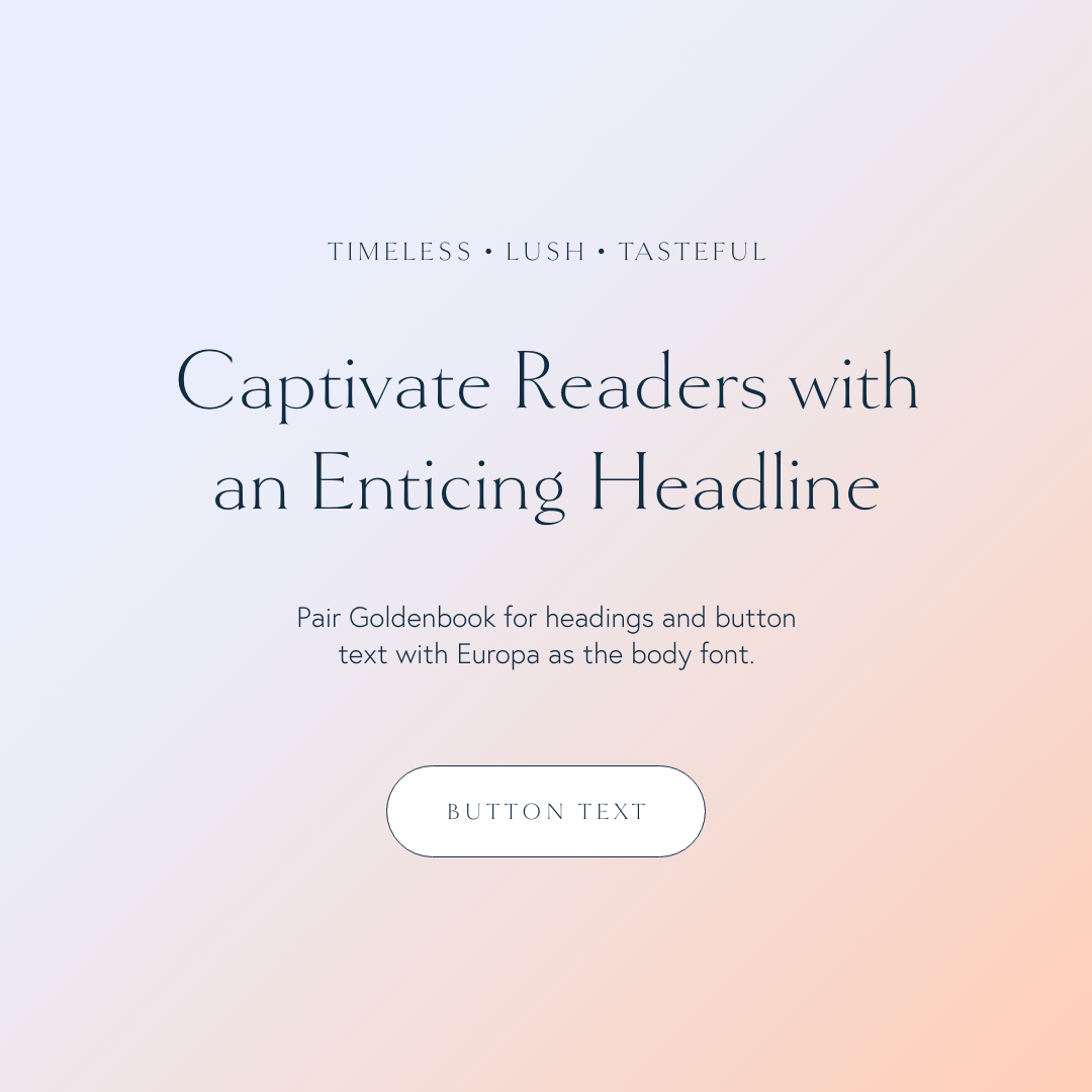
3. Goldenbook + Europa
Timeless and lush, Goldenbook’s classic serif style combined with Europa’s clean, modern sans serif creates a balanced aesthetic. This pairing feels has a very 1930s feel to it, making it ideal for brands that want to look established and trustworthy.
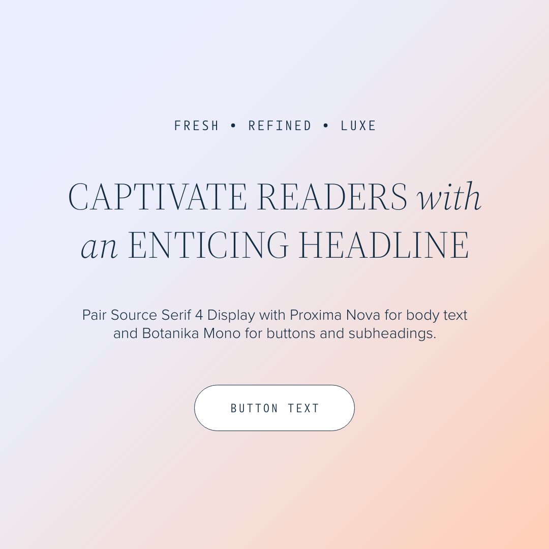
4. Source Serif 4 Display + Proxima Nova + Botanika Mono
This three-font combination feels structured but stylish. Source Serif 4 Display adds a literary flair to headings, Proxima Nova keeps body copy accessible and contemporary, and Botanika Mono gives subheadings and buttons a little tropical flair.
5. Canto Pen + Hypatia Sans Pro
Canto Pen’s handwritten, antiquarian vibe paired with Hypatia Sans Pro creates a beautiful contrast. This pairing works especially well for brands that want to feel personal, creative, and just a little bit nostalgic.
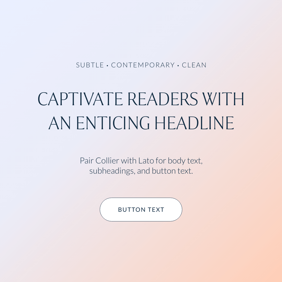
6. Collier + Lato
If you want something modern but understated, Collier and Lato are a dream team. Collier gives headings a strong but subtle presence, while Lato’s clean, versatile style ensures your body copy feels friendly and effortless to read. We use this font pairing on our Sparhawk template.

7. IvyMode + Orpheus Pro + Alegreya Sans
This trio combines polish with a hint of softness. IvyMode headlines feel modern and minimal, Orpheus Pro brings warmth to body text, and Alegreya Sans adds a versatile edge to buttons and subheadings. A great choice for stylish modern brands.
8. Freight Display Compressed Pro + Freight Sans Pro
When you want your website to feel cosmopolitan and refined, Freight Display Compressed Pro and Freight Sans Pro work wonders. This seamless same-family pairing gives an ultra-polished look perfect for high-end brands.


9. Bebas Neue + Poppins
Bebas Neue is a powerful, no-nonsense font that demands attention in your headings. Poppins softens it with rounded sans serif lettering, creating a nice balance between impact and readability. This is a go-to choice for entrepreneurs who want a bold, energetic site.
10. Acumin Pro Extra Condensed + Adelle Sans
This duo delivers drama and an ultra-modern edge. Acumin Pro Extra Condensed creates high-impact headings, while Adelle Sans keeps your body text and secondary elements feeling easy and contemporary. This pairing is ideal for brands that want a clean but striking online presence.


11. Termina + Abel
If futuristic is your vibe, Termina and Abel should be on your radar. The contrast between Termina’s expanded look and Abel’s edgy condensed look makes an unforgettable first impression.
12. Aktiv Grotesk + Urbane
Aktiv Grotesk and Urbane give off a bold, contemporary, and confident vibe. This pairing is perfect if you want a site that feels fresh, progressive, and unafraid to make a statement.


If you want to create a site that looks and feels like the next-level version of your brand, start by choosing the right fonts. The right combination will not only elevate your design—it’ll also make your message clearer and more compelling to every visitor who lands on your page.
![How to Add Custom Fonts to Squarespace in 3 Easy Steps [2026]](https://images.squarespace-cdn.com/content/v1/660c2a0cc0baf42503668a1b/1745911095883-KS0B8HP7U2U6FL6MN1C6/how-to-add-custom-fonts-squarespace.png)